Spoiler
v0.0.10
The Mishka Chelekom Mob Spoiler shows long content on iOS and Android and starts it collapsed behind a Show more control. It is the native port of the headless Spoiler and runs on Mob.
Overview of the Mob Spoiler component for iOS and Android
Spoiler is a pure Elixir Mob composite. You write it as a <MishkaSpoiler> tag and put the full content in the tag's children. While expanded is false, the component shows the preview nodes instead, for example one truncated line.
A spoiler and a Mob Collapsible share a mechanism but serve different purposes. A collapsible hides secondary content behind a titled header that you read first. A spoiler holds content that is already the point and is only too long. So the control sits under the content, and it is a text link rather than a panel header.
The control's label follows the state: "Show more" while collapsed and "Show less" while expanded. You can replace both with show_label and hide_label.
The screen owns the state. You keep a boolean in your assigns, pass it in as expanded, and flip it when the {:tap, tag} message arrives in handle_info/2.
The control is wrapped in vertical padding, 10 by default, because a single line of text is a small tap target. The padding is vertical only, so the label stays flush with the content above it and a stray tap elsewhere on the row does not toggle the spoiler.
Generate the spoiler component
Run this from your Mob app's root to add the component to lib/<app>/components/:
mix mishka.ui.gen.mob spoilerThe generator registers the tag, so you can use it in ~MOB markup. It also copies the shared Event helper module that the component uses to wire its tap handler. The examples on this page use the mishka_ prefix of the showcase app (--module-prefix mishka_), so the tag is <MishkaSpoiler>. Without a prefix, the tag is <Spoiler>.
Reveal the rest of the content
The control sits under the content, and its label follows the state. The handler receives a bare {:tap, :more}, because a spoiler has one region and nothing needs identifying. The screen only flips a boolean.
Reveal the rest of the content
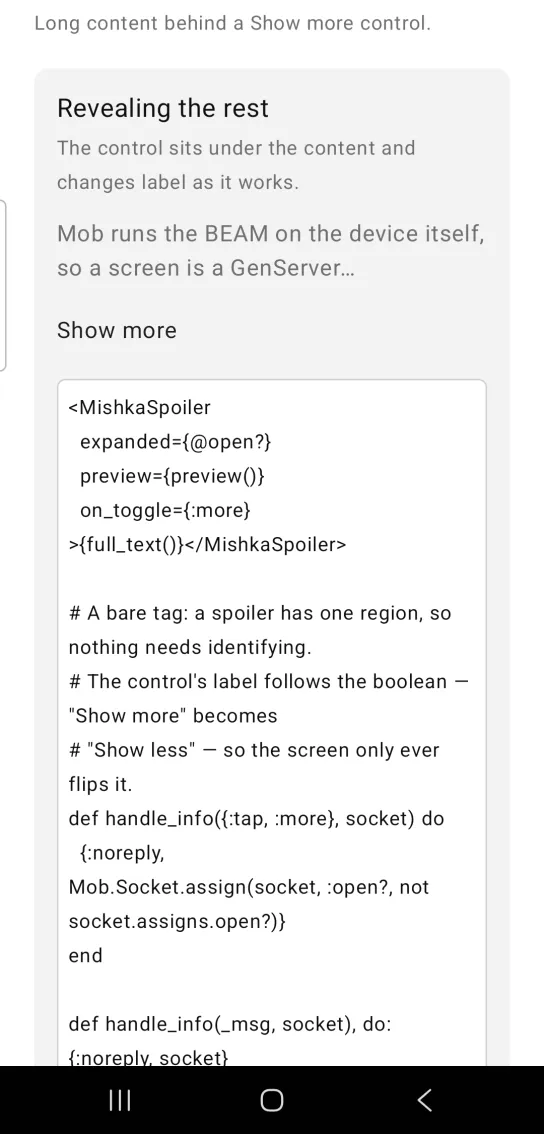
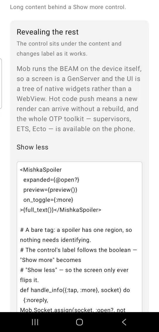
Left: the example as it loads. Right: after a tap. Long content sits behind a Show more control.
<MishkaSpoiler
  expanded={@open?}
  preview={preview()}
  on_toggle={:more}
>{full_text()}</MishkaSpoiler>

# A bare tag: a spoiler has one region, so nothing needs identifying.
# The control's label follows the boolean — "Show more" becomes
# "Show less" — so the screen only ever flips it.
def handle_info({:tap, :more}, socket) do
  {:noreply, Mob.Socket.assign(socket, :open?, not socket.assigns.open?)}
end

def handle_info(_msg, socket), do: {:noreply, socket}
Spoiler with custom labels
show_label and hide_label replace the default labels.
Spoiler with custom labels
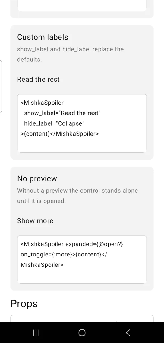
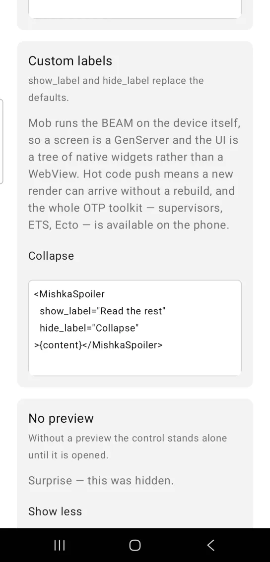
Left: the example as it loads. Right: after a tap. The show and hide labels are props.
<MishkaSpoiler
  show_label="Read the rest"
  hide_label="Collapse"
>{content}</MishkaSpoiler>
Spoiler without a preview
Without a preview, the control stands alone until you open the spoiler.
Spoiler without a preview
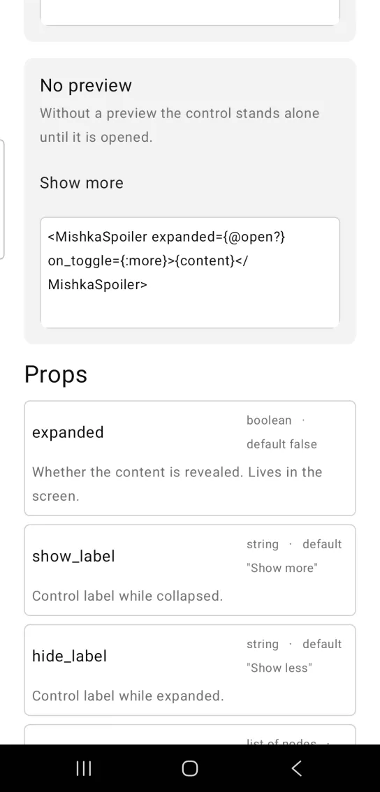
<MishkaSpoiler expanded={@open?} on_toggle={:more}>{content}</MishkaSpoiler>Props
Props of the <MishkaSpoiler> tag.
| Prop | Type | Default | Description |
|---|---|---|---|
expanded | boolean | false | Whether the content is revealed. It lives in the screen. |
show_label | string | "Show more" | Control label while collapsed. |
hide_label | string | "Show less" | Control label while expanded. |
preview | list of nodes | [] | What to show while collapsed, for example a truncated line. |
on_toggle | event tag | None | Sent as {:tap, tag}. |
padding | number | 10 | Vertical padding around the control. The padding is the tap target. |
color | color / ARGB | :primary | Control color. |
Events
on_toggle sends a bare {:tap, tag} to your screen's handle_info/2. The label changes with expanded, so the handler only flips the boolean:
def handle_info({:tap, :more}, socket) do
  {:noreply, Mob.Socket.assign(socket, :open?, not socket.assigns.open?)}
end
Differences from the web component
These web attributes are not ported:
id.- The
*_classattributes.
Attributes
| Name | Type | Default | Values | Required | Description |
|---|---|---|---|---|---|
expanded
|
boolean
|
false
| — | No | Whether the content is revealed. |
show_label
|
string
|
"Show more"
| — | No | Control label while collapsed. |
hide_label
|
string
|
"Show less"
| — | No | Control label while expanded. |
preview
|
list of nodes
|
[]
| — | No | What to show while collapsed (e.g. a truncated line). |
on_toggle
|
event tag (atom)
| — | — | No | Sent as `{:tap, tag}`. |
color
|
color token / ARGB int
|
:primary
| — | No | Control colour. |
padding
|
number
|
10
| — | No | Vertical padding around the control — it is the tap target, not decoration. |
Options
Each option takes one or more of its values, separated by commas.
| Option | Values |
|---|---|
--type
|
spoiler
|
--module
| A module name of your own |
What it generates
mix mishka.ui.gen.mob spoiler