Fieldset
v0.0.10
The Mishka Chelekom Mob Fieldset groups related controls under a legend on iOS and Android. It is the native port of the headless Fieldset and runs on Mob.
Overview of the Mob Fieldset component for iOS and Android
Fieldset draws the legend text above a column that holds its children, with space between the two. Give it background, padding or corner_radius and it wraps the group in a box, so the group reads as a panel. With none of those three props it adds no box.
The screen owns the state. Fieldset keeps none and has no event props. The controls inside it, usually Field components, send their events to your screen.
In a browser, <fieldset disabled> disables every control inside it. A Mob node tree has no ownership relationship that lets a parent switch off its children, and rewriting arbitrary children to inject disabled: true would mangle nodes the component does not understand. So disabled mutes the legend and nothing more.
The legend color defaults to :on_surface, the ink of a theme surface. When you set your own background, also set color so the legend stays readable.
Generate the fieldset component
Run this from your Mob app's root to add the component to lib/<app>/components/:
mix mishka.ui.gen.mob fieldsetThe generator registers the tag, so you can use it in ~MOB markup. The examples on this page use the mishka_ prefix of the showcase app (--module-prefix mishka_), so the tag is <MishkaFieldset>. Without a prefix, the tag is <Fieldset>.
Fieldset with a legend
Set legend to title the group and pass the controls as children. In the snippet, line1() and city() stand for the nodes of your controls. The showcase wraps two Field components in a group with background, padding and corner_radius set, which draws the group as a raised panel.
Fieldset with a legend
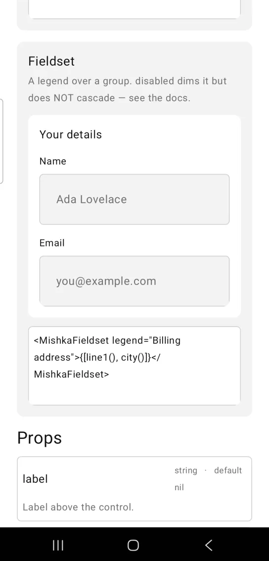
<MishkaFieldset legend="Billing address">{[line1(), city()]}</MishkaFieldset>Props
Props of the <MishkaFieldset> tag. The children are the controls.
| Prop | Type | Default | Description |
|---|---|---|---|
legend | string | nil | The group's heading. |
disabled | boolean | false | Mutes the legend. It does not cascade to the controls. |
space | number | 14 | Gap between the legend and the controls. |
color | color token or ARGB integer | :on_surface | Color of the legend. Set it whenever you set background. |
background | color token or ARGB integer | nil | Optional fill for the group. |
padding | spacing token or number | nil | Optional padding inside the group. |
corner_radius | radius token or number | nil | Optional rounding for the group. |
Differences from the web component
disableddoes not switch off the controls inside the group. The browser's<fieldset disabled>does.idand the*_classattributes are not ported. Color, spacing and rounding are props.
Attributes
| Name | Type | Default | Values | Required | Description |
|---|---|---|---|---|---|
legend
|
string
| — | — | No | The group's heading. |
disabled
|
boolean
|
false
| — | No | Mutes the legend. Does NOT cascade — see above. |
space
|
number
|
14
| — | No | Gap between the legend and the controls. |
color
|
color token / ARGB int
|
:on_surface
| — | No | The legend. Set it whenever you set `background`. |
background
|
color token / ARGB int
| — | — | No | Optional group fill. |
padding
|
spacing token / number
| — | — | No | Optional padding. |
corner_radius
|
radius token / number
| — | — | No | Optional rounding. |
Options
Each option takes one or more of its values, separated by commas.
| Option | Values |
|---|---|
--type
|
fieldset
|
--module
| A module name of your own |
What it generates
mix mishka.ui.gen.mob fieldset