Overview of the Phoenix and LiveView Headless Preview Card Component
The Mishka Chelekom Headless Preview Card
ships zero opinionated styling
- only the semantic markup, anchored
popup positioning (side, align, offset, edge-flip and viewport clamp), and
paired-presence state
(
data-open
/
data-closed
).
Every part - trigger, popup, and
arrow
- is addressable through a
*_class
attribute, so you style it entirely with your own Tailwind
classes
while the anchoring and behavior keep working underneath. It is
non-modal
and never steals focus from the page.
Base UI Preview Card example (Phoenix headless)
The principles of good
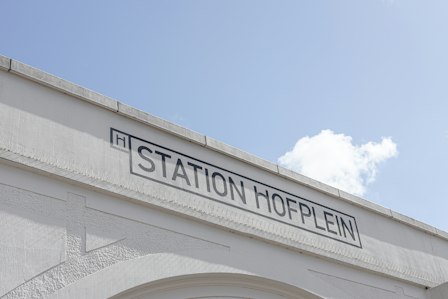
Typography is the art and science of arranging type to make written language clear, visually appealing, and effective in communication.
<p class="m-0 text-base text-neutral-950 text-balance dark:text-white">
  The principles of good
  <.preview_card
    id="baseui-preview_card-hero"
    side_offset={8}
    class="inline"
    trigger_class="cursor-pointer text-neutral-950 underline decoration-neutral-950/60 decoration-1 underline-offset-2 outline-0 hover:decoration-neutral-950 data-[popup-open]:decoration-neutral-950 focus-visible:no-underline focus-visible:outline-2 focus-visible:outline-neutral-950 dark:text-white dark:decoration-white/60 dark:hover:decoration-white dark:data-[popup-open]:decoration-white dark:focus-visible:outline-white"
    popup_class="group relative h-[var(--popup-height,auto)] w-[var(--popup-width,auto)] origin-[var(--transform-origin)] border border-neutral-950 bg-white text-neutral-950 shadow-[0.25rem_0.25rem_0] shadow-black/12 transition-[transform,opacity] duration-100 ease-out data-[ending-style]:[transform:scale(0.98)] data-[ending-style]:opacity-0 data-[starting-style]:[transform:scale(0.98)] data-[starting-style]:opacity-0 dark:border-white dark:bg-neutral-950 dark:text-white dark:shadow-none"
    arrow_class="relative block h-1.5 w-3 overflow-clip group-data-[side=bottom]:top-[-6px] group-data-[side=left]:right-[-9px] group-data-[side=left]:rotate-90 group-data-[side=right]:left-[-9px] group-data-[side=right]:-rotate-90 group-data-[side=top]:bottom-[-6px] group-data-[side=top]:rotate-180 before:absolute before:bottom-0 before:left-1/2 before:h-[calc(6px*sqrt(2))] before:w-[calc(6px*sqrt(2))] before:border before:border-neutral-950 before:bg-white before:content-[''] before:[transform:translate(-50%,50%)_rotate(45deg)] dark:before:border-white dark:before:bg-neutral-950"
  >
    <:trigger>typography</:trigger>
    <:arrow></:arrow>
    <div class="flex w-min flex-col gap-2 p-2">
      <img
        width="224"
        height="150"
        class="block max-w-none"
        src="https://images.unsplash.com/photo-1619615391095-dfa29e1672ef?q=80&w=448&h=300"
        alt="Station Hofplein signage in Rotterdam, Netherlands"
      />
      <p class="m-0 text-sm text-pretty">
        <strong>Typography</strong> is the art and science of arranging type to make written
        language clear, visually appealing, and effective in communication.
      </p>
    </div>
  </.preview_card>
  remain in the digital age.
</p>
Parts & data attributes
Each part carries a stable
data-part
and a structural
chelekom-preview_card__*
class you can target, plus paired-presence state for open/closed transitions.
| Part | data-part | State / ARIA | Purpose |
|---|---|---|---|
| Root | - | data-open, data-closed, data-side, data-align | The wrapping element that carries the open/closed state. |
| Trigger | trigger | aria-expanded, aria-controls, data-popup-open | The hovered/focused element (usually a link) that reveals the preview. |
| Popup | popup | role="dialog", data-open, data-closed, data-side, data-align, data-starting-style | The floating preview panel, anchored to the trigger. |
| Arrow | arrow | aria-hidden | Optional pointer arrow rendered inside the popup; carries data-side. |
Accessibility
Follows the
WAI-ARIA Authoring Practices Guide
for a non-modal hover card with anchored positioning:
Escape
closes the popup, moving the pointer or focus away closes it after
close_delay
, and moving the pointer into the
popup keeps it open. Focus is never stolen - it stays on the trigger, and the popup is
reachable by keyboard and hoverable by mouse.