Radio group
v0.0.10
mix mishka.ui.gen.mob radio_group
The Mishka Chelekom Mob Radio Group is a labeled set of mutually exclusive options for iOS and Android apps built with Mob. It is the native port of the headless Radio Group.
Overview of the Mob Radio Group component for iOS and Android
MishkaRadioGroup builds on the Mob Radio component and does not redraw the circle, so a single radio and a grouped one are the same control. The group adds three things a lone radio cannot know about itself: which option is selected (value), a group label, and a group-wide disabled that applies to every option.
On the web, a shared name makes the browser allow one selected radio. Here the group does it. Every option reports the same on_change tag with its own id added, and select/2 returns the next value. Tapping the selected option keeps it selected, unlike a checkbox.
Write options as <MishkaRadioGroupOption> children, the native version of the Phoenix component's <:radio> slots. Each option takes id, label and disabled. When the options come from data, option/3 builds the identical node, so you can mix the tag and the function.
A vertical group is the default. Each radio fills the width, so the label is part of the tap target. In a horizontal group each radio hugs its label. A radio that filled the width would take the whole row and push its siblings off screen.
Give the group an id to name each option for device tests. With id="plan", the :pro ring is tagged plan-pro-selected or plan-pro-empty.
Generate the radio group component
Run this from your Mob app's root to add the component to lib/<app>/components/:
mix mishka.ui.gen.mob radio_groupThe generator registers the <RadioGroup> tag so you can use it in ~MOB markup. It also generates the Radio component, because the group draws its options with it, and copies the shared Event support module. The examples on this page use the mishka_ prefix of the showcase app (--module-prefix mishka_), so the tag is <MishkaRadioGroup>. Without a prefix the tag is <RadioGroup>.
To generate it with that prefix, run:
mix mishka.ui.gen.mob radio_group --module-prefix mishka_Labeled radio group
Give the group a label, a value and one on_change tag. Each option sends {:tap, {tag, option_id}}, so one handler serves the whole group. select/2 computes the next value.
Labeled radio group
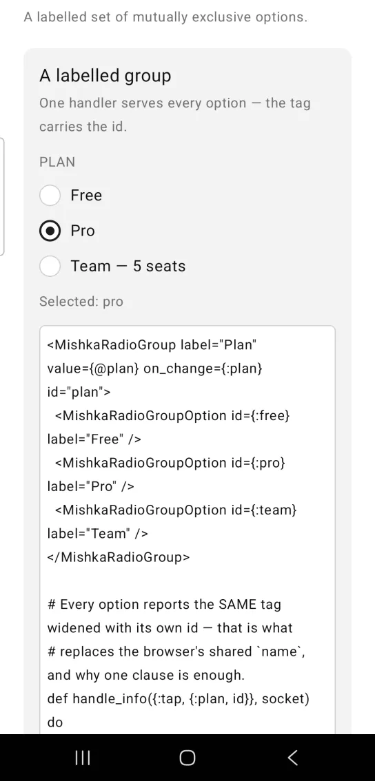
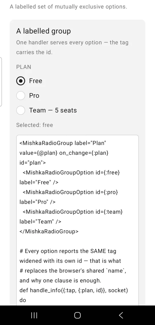
Left: the example as it loads. Right: after a tap. One handler serves every option in the group.
<MishkaRadioGroup label="Plan" value={@plan} on_change={:plan} id="plan">
  <MishkaRadioGroupOption id={:free} label="Free" />
  <MishkaRadioGroupOption id={:pro} label="Pro" />
  <MishkaRadioGroupOption id={:team} label="Team" />
</MishkaRadioGroup>

# Every option reports the SAME tag widened with its own id — that is what
# replaces the browser's shared `name`, and why one clause is enough.
def handle_info({:tap, {:plan, id}}, socket) do
  {:noreply, Mob.Socket.assign(socket, :plan, MishkaRadioGroup.select(socket.assigns.plan, id))}
end

def handle_info(_msg, socket), do: {:noreply, socket}
Horizontal radio group
Set orientation to :horizontal to lay the options in a row. space sets the gap between them. Each option then sizes to its label.
Horizontal radio group
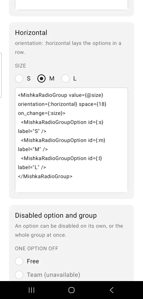
<MishkaRadioGroup value={@size} orientation={:horizontal} space={18} on_change={:size}>
  <MishkaRadioGroupOption id={:s} label="S" />
  <MishkaRadioGroupOption id={:m} label="M" />
  <MishkaRadioGroupOption id={:l} label="L" />
</MishkaRadioGroup>
Disabled radio group options
Put disabled on an option tag to disable that option. Put it on the group to disable every option at once.
Disabled radio group options
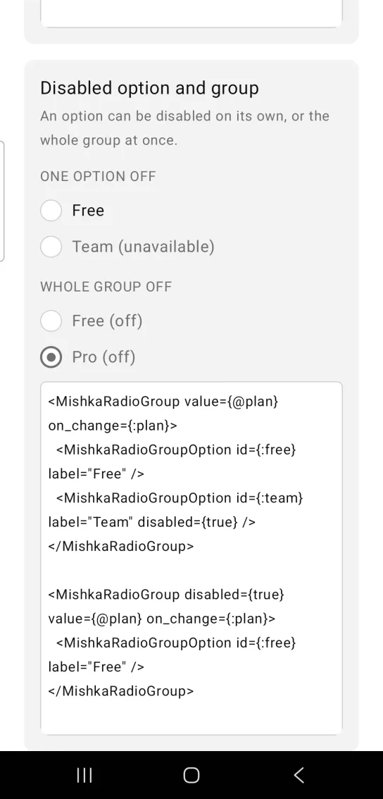
<MishkaRadioGroup value={@plan} on_change={:plan}>
  <MishkaRadioGroupOption id={:free} label="Free" />
  <MishkaRadioGroupOption id={:team} label="Team" disabled={true} />
</MishkaRadioGroup>

<MishkaRadioGroup disabled={true} value={@plan} on_change={:plan}>
  <MishkaRadioGroupOption id={:free} label="Free" />
</MishkaRadioGroup>
Radio group color and size
color and size pass through to every option in the group.
Radio group color and size
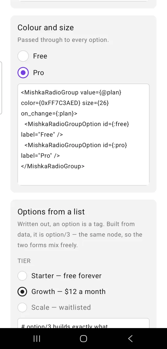
<MishkaRadioGroup value={@plan} color={0xFF7C3AED} size={26} on_change={:plan}>
  <MishkaRadioGroupOption id={:free} label="Free" />
  <MishkaRadioGroupOption id={:pro} label="Pro" />
</MishkaRadioGroup>
Radio group options from a list
Written out, an option is a tag. Built from data, it is option/3, which produces the same node, so the two forms mix freely. Use the tag when you list the options by hand and the function when they come from a list.
Radio group options from a list
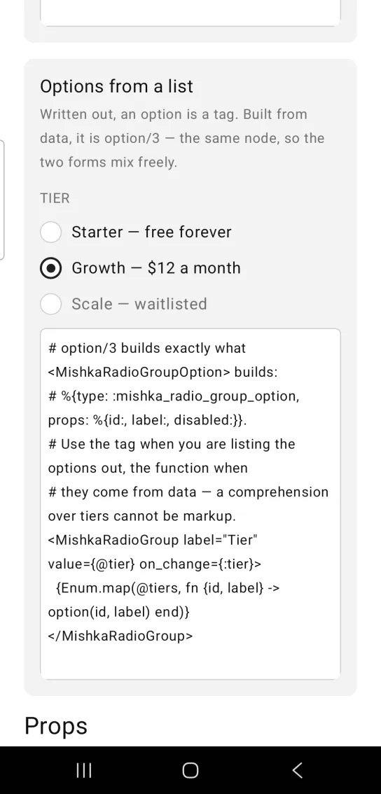
# option/3 builds exactly what <MishkaRadioGroupOption> builds:
# %{type: :mishka_radio_group_option, props: %{id:, label:, disabled:}}.
# Use the tag when you are listing the options out, the function when
# they come from data — a comprehension over tiers cannot be markup.
<MishkaRadioGroup label="Tier" value={@tier} on_change={:tier}>
  {Enum.map(@tiers, fn {id, label} -> option(id, label) end)}
</MishkaRadioGroup>
Props
| Prop | Type | Default | Description |
|---|---|---|---|
value | option id | nil | The id of the selected option. |
label | string | nil | Group heading. |
<MishkaRadioGroupOption> | slot | None | One option, with id, label and disabled. option/3 builds the same node. |
disabled | boolean | false | Disables every option. |
on_change | event tag | None | Sent as {:tap, {tag, option_id}}, so one handler serves the group. |
orientation | :vertical or :horizontal | :vertical | Layout axis. |
space | number | 12 | Gap between options. |
color and size | see Radio | None | Passed to every option. See Mob Radio. |
id | string | nil | Prefix for each option's test tag, such as plan-pro-selected. |
select/2 | helper | None | Returns the next value for a tap. Tapping the selected option keeps it. |
Events
Your screen receives {:tap, {tag, option_id}} in handle_info/2 from on_change. Every option reports the same tag with its own id, so one clause serves the group:
def handle_info({:tap, {:plan, id}}, socket) do
  {:noreply, Mob.Socket.assign(socket, :plan, MishkaRadioGroup.select(socket.assigns.plan, id))}
end

def handle_info(_msg, socket), do: {:noreply, socket}
Differences from the web component
name,requiredandformare not ported. They are HTML form plumbing.- The web
idand the*_classattributes are not ported. The Mobidprop is a prefix for native test tags. readonlyanddisabledbecome one prop,disabled.
Attributes
| Name | Type | Default | Values | Required | Description |
|---|---|---|---|---|---|
value
|
option id
| — | — | No | The selected option. |
label
|
string
| — | — | No | Group heading. |
disabled
|
boolean
|
false
| — | No | Disables every option. |
on_change
|
event tag (atom)
| — | — | No | Sent as `{:tap, {tag, option_id}}`. |
orientation
|
:vertical :horizontal
|
:vertical
| — | No | Layout axis. |
space
|
number
|
12
| — | No | Gap between options. |
color / size
|
see Radio
| — | — | No | Passed to every option. |
id
|
string
| — | — | No | Prefix for each option's test tag. |
Options
Each option takes one or more of its values, separated by commas.
| Option | Values |
|---|---|
--type
|
radio_group
|
--module
| A module name of your own |
What it generates
mix mishka.ui.gen.mob radio_group